
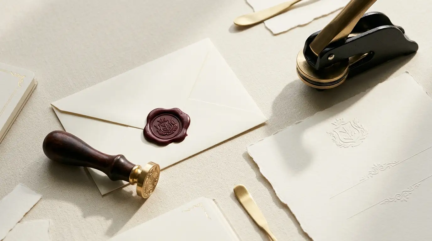

In luxury publishing and personal branding, presentation dictates perceived value. Physical details like hand-poured metallic wax seals and crisp blind-embossed crests establish tangible authority. Digitally, structural details like aesthetic symbol dividers preserve that same editorial rhythm.
This master guide covers the technical specifications for custom brass wax seals, paper embosser weight tolerances, and copy-and-paste aesthetic symbol dividers for Rentry, Notion, and digital publications.
Table of Contents
Master Comparison Matrix: Physical & Digital Detail Tools
| Tool / Technique | Primary Medium | Visual Aesthetic | Ideal Application | Key Specification |
| Custom Brass Wax Seal | Melted resin wax & solid brass die | Old-world, 3D tactile relief, romantic | Envelope closures, ribbon accents, wine bottles | 1.5mm minimum die engraving depth |
| Custom Paper Embosser | Heavy paper stock & metal press die | Clean, modern, understated blind debossing | Letterheads, inner card flaps, library bookplates | Optimal on 120 GSM to 250 GSM paper stock |
| Aesthetic Symbol Dividers | Unicode characters & glyph patterns | Minimalist, editorial rhythm, structured | Rentry pages, blog posts, Notion dashboards | Non-breaking spaces for mobile alignment |
Custom Brass Wax Seal Stamps: Old-World Prestige
Custom wax seals deliver immediate tactile authority. Modern luxury wax sealing requires balancing traditional aesthetics with contemporary durability.
Essential Specifications for Clean Seals
- Brass Die Engraving Depth: Require a minimum engraving depth of 1.5mm on solid brass dies. Deeper milling creates clean dimensional relief while preventing melted wax from binding inside fine lettering or complex crests.
- Flexible Resin Formulations: Traditional historic sealing wax used brittle shellac, which snaps easily in modern mail sorting equipment. Opt for modern flexible wax beads made from synthetic resin and beeswax blends to guarantee intact arrival.
- Temperature Management: When producing large batches of invitations, place your brass die on an ice pack or marble block between pours. A chilled die releases instantly from warm wax, leaving crisp, sharp edges.
Recommended Tooling:
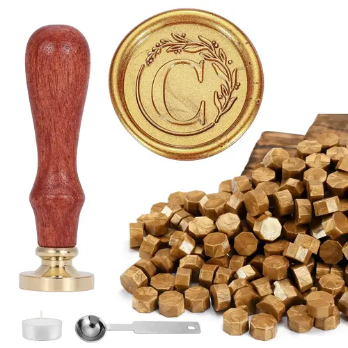
Choose a kit containing an electric melting furnace to maintain constant wax temperature during high-volume production.
Custom Paper Embosser Secrets: Precision Blind Debossing
Paper embossers create raised relief without ink—a process known as blind debossing. This delivers a clean, subtle mark ideal for high-end stationery, corporate letterhead, and personal library collections.
Paper Weight Tolerances & Orientation Rules
- Paper Stock Density (GSM): Standard handheld desk embossers perform cleanly on paper weights between 120 GSM and 250 GSM. For thick cotton stock exceeding 300 GSM, use a long-reach heavy-duty lever desk press to prevent incomplete impressions or paper tearing.
- Die Orientation Config: Embosser dies are directional. You must specify insertion point when ordering: Top Flap (for envelope closures), Bottom Margin (for letterhead and certificates), or Side Margin (for bookplates).
Recommended Tooling:
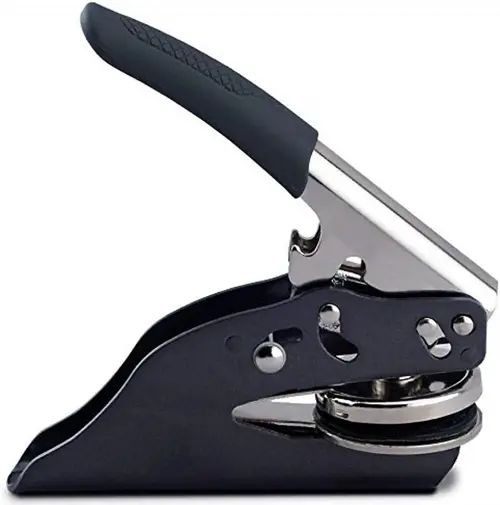
Look for interchangeable stainless steel die inserts to switch between personal monograms and business logos on a single press body.
Aesthetic Rentry Dividers & Digital Page Formatting
Aesthetic Symbol Dividers: Bringing Tactile Branding into Digital Design
Aesthetic symbol dividers bring the elegance of wax seals and embossed monograms to digital pages. Unlike standard horizontal rules, Unicode symbols add personality and visual structure to Rentry pages, Notion dashboards, and blogs.
Choose designs that complement your brand and use consistent spacing to maintain a polished, editorial look.
How to Choose the Right Aesthetic Divider
Before selecting a divider, consider the mood you want to communicate and the purpose of the page.
- Minimalist and botanical: Ideal for wellness brands, lifestyle blogs, digital journals, and understated luxury aesthetics.
- Celestial and classic: Suitable for creative portfolios, personal landing pages, literary publications, and dreamy editorial layouts.
- Classical monogram and crest: A natural fit for heritage-inspired branding, luxury stationery, formal invitations, and sophisticated personal websites.
- Geometric and contemporary: Best for technology publications, professional portfolios, and modern editorial layouts that favor clean structure over ornamentation.
For the best results, use one primary divider style throughout a page. You can introduce a secondary variation for major chapter breaks, but too many unrelated patterns can make a design feel cluttered.
Curated Aesthetic Divider Collection
The following copy-and-paste dividers offer several visual styles for digital publications. You can use them as section separators, decorative borders, or small editorial accents wherever your platform supports the relevant Unicode characters.
1. Minimalist Botanical Dividers
Best for: Lifestyle blogs, wellness content, nature-inspired branding, and elegant digital journals.
These patterns combine delicate floral or botanical-inspired characters with simple lines. Their restrained appearance makes them useful when you want to introduce decoration without competing with the main text.
Simple botanical accent
─── 𖥸 ───
Decorative floral border
❀•°•═════•°•❀
Minimal floral transition
──── ❀ ────
Symmetrical botanical detail
✿ ── 𖥸 ── ✿
Styling tip: Place a botanical divider between major sections rather than after every paragraph. On a luxury lifestyle page, generous white space around the symbol helps preserve an airy, editorial feel.
2. Celestial and Classic Dividers
Best for: Personal websites, creative writing, digital mood boards, literary pages, and dreamy editorial themes.
Celestial dividers use stars, circles, and repeating decorative characters to create a sense of movement. They are especially effective on pages with a romantic, whimsical, vintage, or night-sky-inspired visual identity.
Classic star divider
─── ⋆⋅☆⋅⋆ ───
Repeating celestial pattern
◦°˚°◦.◦°˚°◦.◦°˚°◦
Minimal star accent
✧ ───── ✧
Ornamental celestial line
⋆。°✩ ───── ✩°。⋆
Styling tip: Use celestial patterns to introduce a new chapter, frame a short quotation, or distinguish a personal note from the main article. Avoid placing several elaborate patterns close together, as this can weaken the page’s visual hierarchy.
3. Classical Monogram and Crest Dividers
Best for: Luxury branding, heritage-inspired websites, formal stationery, elegant invitations, and personal monogram pages.
Classical dividers draw on the visual language of traditional crests, ornamental flourishes, and symmetrical insignias. They help connect digital presentation with the craftsmanship associated with embossed stationery, wax seals, and engraved metal stamps.
Geometric crest divider
✦ ─── ❖ ─── ✦
Fleur-de-lis-inspired accent
─── ⚜ ───
Formal ornamental line
◆ ───── ◆
Symmetrical monogram-style divider
✧ ── ❖ ── ✧
Styling tip: These designs work particularly well beneath a page title, above a signature, or between major editorial sections. For a refined result, pair them with restrained typography and consistent margins rather than adding multiple competing decorative elements.
4. Minimalist Geometric Dividers
Best for: Modern blogs, professional portfolios, technology publications, and clean Notion dashboards.
Geometric dividers create structure without introducing a strong decorative theme. They are useful when the surrounding design already contains visual elements, such as illustrations, cards, tables, or bold headings.
Clean linear divider
────────────
Centered geometric accent
─── ◆ ───
Modern diamond pattern
◇ ── ◇ ── ◇
Compact editorial separator
• ───── •
Styling tip: Choose geometric dividers when readability and clarity matter more than ornamentation. Their simple shapes are often easier to integrate into professional and information-heavy layouts.
How to Use Unicode Dividers on Rentry, Notion, and Blogs
Although the same divider can appear across multiple platforms, its rendering may vary according to the editor, font, device, and available character support.
On Rentry pages: Paste a divider on its own line between content sections. If the page uses Markdown, check how the editor interprets surrounding characters and blank lines. Keep decorative patterns separate from headings so that the page structure remains clear.
In Notion: Add a divider as a standalone text block. Unicode patterns can provide a more personalized aesthetic than a standard separator, although they do not replace Notion’s semantic headings or built-in divider blocks. Preview the page in both desktop and mobile layouts.
On WordPress blogs: Insert decorative characters into a paragraph or a suitable text block. If your theme supports custom styling, you can center the divider and adjust its spacing through the block settings or CSS. For accessibility and consistent formatting, keep the divider decorative rather than using it as the only indication that a new section has begun.
On personal landing pages: Use a divider to frame a short introduction, separate portfolio categories, or create a transition between an about section and a contact area. Match the design to the page’s existing typography and spacing.
Best Practices for Clean Digital Page Formatting
Aesthetic dividers should improve the reading experience, not become the main attraction. Apply the following principles to keep your layouts polished and functional.
1. Preserve consistent spacing. Leave enough room above and below each divider to distinguish it from the surrounding text. Crowded decorative elements can make long pages difficult to scan.
2. Test mobile alignment. Unicode characters do not always occupy the same visual width across fonts and devices. A pattern that looks symmetrical on a desktop may wrap or shift on a narrow screen. Prefer shorter patterns for mobile-first layouts.
3. Use spacing carefully. Repeated ordinary spaces may collapse in HTML, while non-breaking spaces can prevent certain breaks but may also cause horizontal overflow. Avoid relying on long strings of spaces for precise alignment. Use the editor’s alignment settings or CSS when consistent positioning is essential.
4. Maintain accessible structure. Keep headings, lists, and paragraphs properly organized. Decorative symbols should not replace descriptive headings, and screen readers may pronounce some Unicode characters in unexpected ways. Use simple patterns and test them with assistive technology when accessibility is a priority.
5. Check character compatibility. Some ornamental glyphs may appear as empty squares or substitute symbols on devices with limited font support. Preview your chosen designs in the target publishing environment before using them across an entire site.
6. Avoid excessive decoration. One consistent divider style can establish a recognizable visual identity. Using a different elaborate pattern after every paragraph can distract readers and dilute the effect of your design.
Creating a Consistent Digital Branding System
Choose dividers that match your brand’s style, whether botanical, minimalist, or heritage-inspired. Use them consistently between major sections, with generous spacing and readable typography, to create a cohesive digital identity without cluttering the page.
Key Takeaways
- Wax Seals: Use solid brass dies with at least 1.5mm engraving depth and flexible resin wax for postal durability.
- Embosser Precision: Select paper stock between 120–250 GSM for standard desk presses, and confirm die orientation before ordering.
- Digital Aesthetics: Use Unicode symbol dividers to mirror physical paper craft structure on Rentry, Notion, and WordPress layouts.
Frequently Asked Questions
What is the difference between a wax seal and a custom embosser?
A wax seal uses melted flexible resin pressed with a brass die to add a raised, colored 3D element to envelopes and packaging. A custom embosser uses a mechanical dual-die press to shape the paper fiber directly, creating a subtle, inkless raised impression.
What paper weight works best for custom paper embossers?
Standard handheld embossers work best on 120 GSM to 250 GSM paper stock. Heavy cardstock above 300 GSM requires a heavy-duty steel desk embosser with an extended lever handle.
How do aesthetic symbol dividers improve digital readability?
Aesthetic symbol dividers replace plain horizontal rules with editorial accents, creating visual breaks that keep readers engaged down the page while maintaining brand continuity.